APRIL HAMILTON | PORTFOLIO
Visual Communication & Brand Design
Brand systems, social content, digital campaigns, and practical design tools built for real communication.
A design has to survive contact with the real world.
It cannot work only in the first mockup.
The idea still has to hold together as a small social graphic, a leadership slide, an email, a video title, an intranet template, a recruiting piece, or a sign across the room. My work is less about designing one isolated object and more about creating a visual direction that remains clear, recognizable, and useful wherever the communication needs to go.
Set direction
Concept, tone, typography, color, imagery, and the rules that make the work feel related.
Organize information
Hierarchy, sequence, spacing, and visual cues that help people find the point.
Adapt responsibly
The same idea rebuilt for the channel instead of stretched, cropped, or reduced until it stops working.
Build for reuse
Templates and systems other people can update without dismantling the design.
CURRENT SOCIAL & DIGITAL DESIGN
A steady brand presence, built one post at a time
At American Public Life, the social calendar has to support very different conversations: supplemental-benefits education, broker relationships, company culture, recruiting, events, community involvement, and everyday brand visibility.
The visual challenge is consistency without making every post look interchangeable. I work within the brand while changing the emphasis, image choice, amount of information, and pacing to match the audience and the job of each piece.
600+
social posts created in 2025.
61K+
impressions across the year.
5,900+
engagements generated.
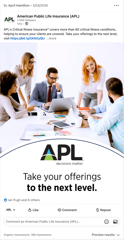
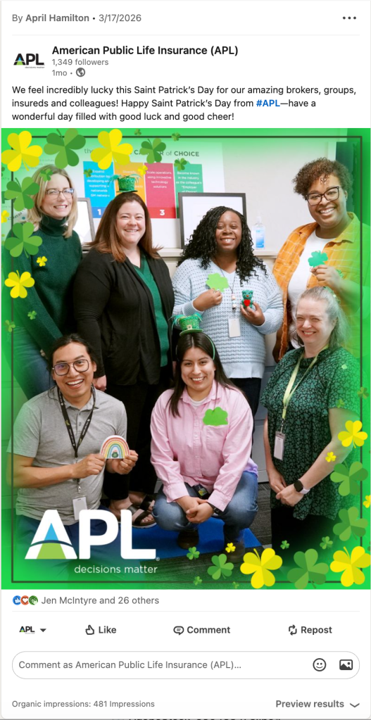
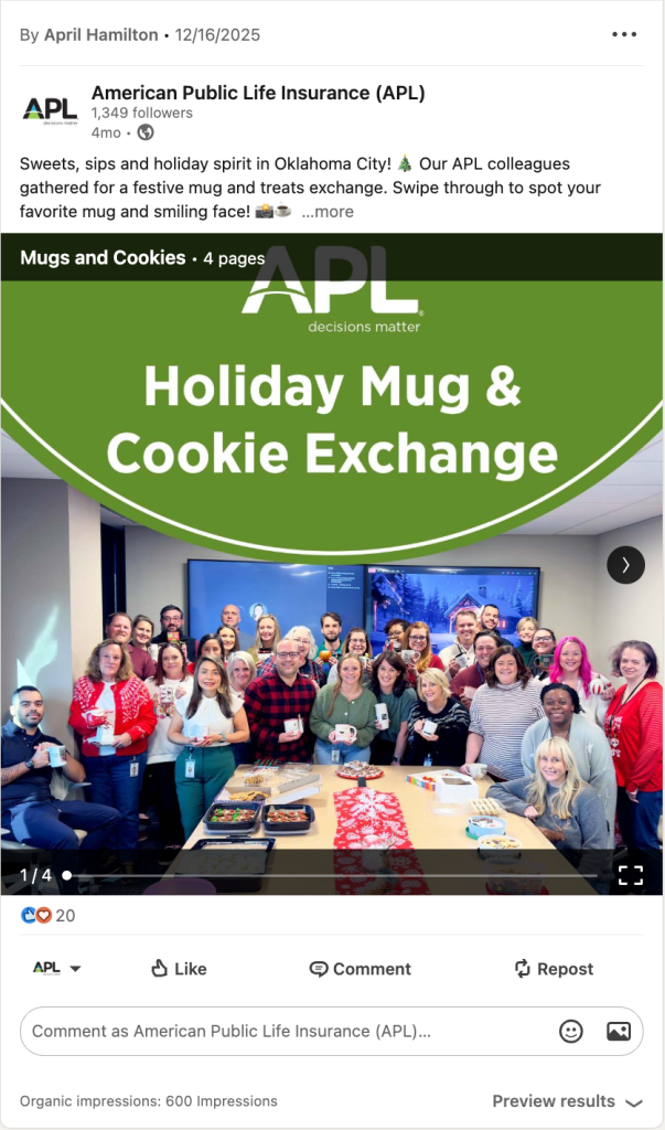
The same 2025 work also produced 2,200+ video views, nearly 2,000 post-link clicks, and LinkedIn follower growth from approximately 1,004 to 1,187.
Design people can keep using
Recurring communication becomes much easier when the design has a clear structure. Across Research Now / Dynata and PCI, I created newsletter formats, announcement layouts, learning materials, intranet graphics, email templates, and reusable page systems that helped teams move faster without making every new piece look unrelated to the last one.
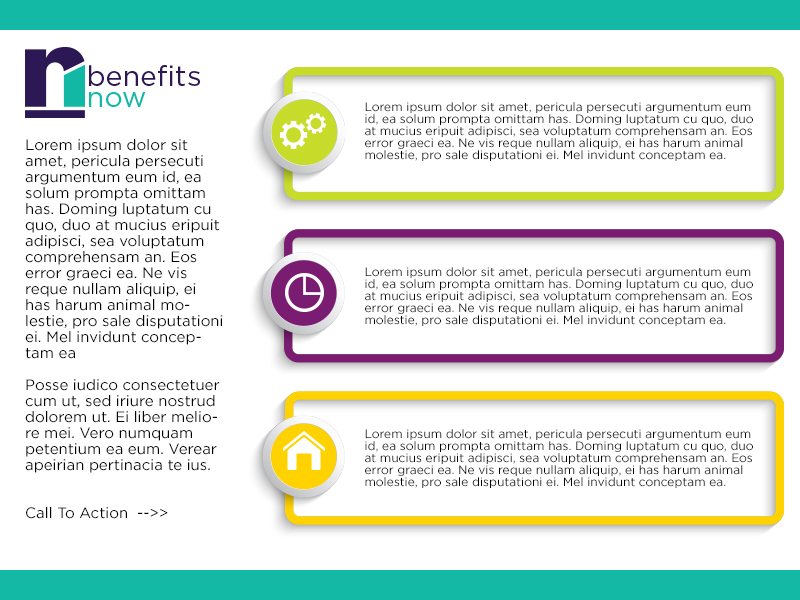
Reusable internal newsletter format.
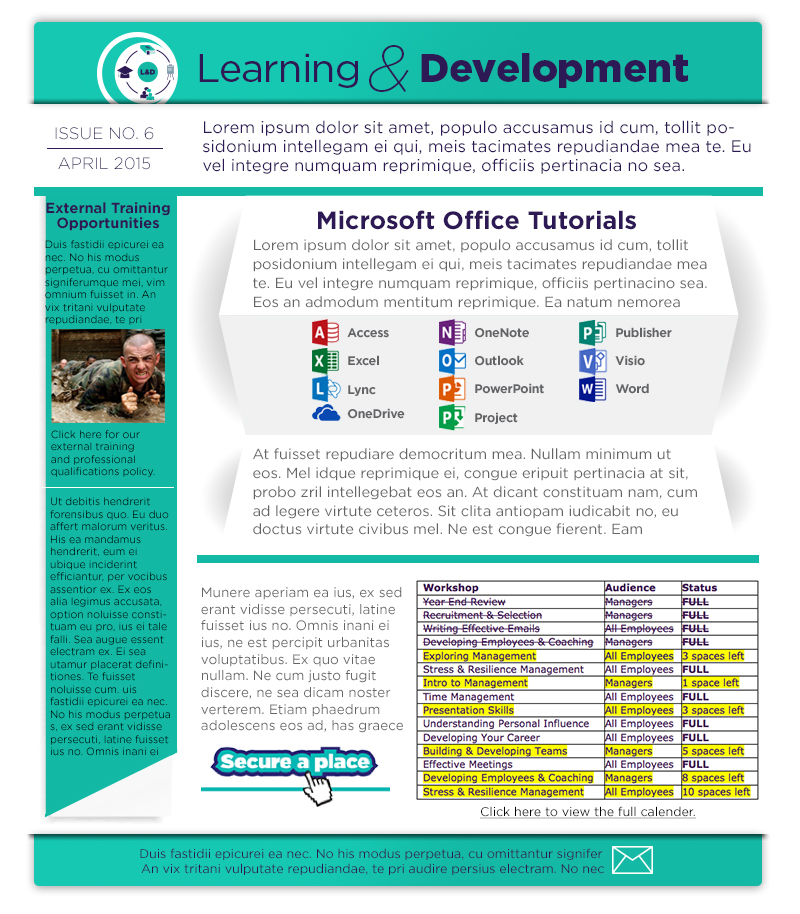
Dense information organized for scanning.
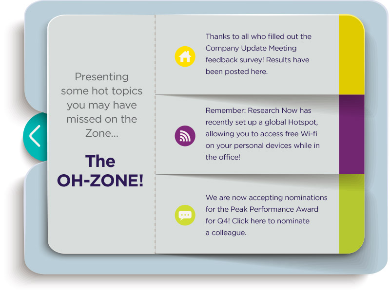
A recognizable frame for recurring employee updates.
The real test: Can someone find the information, recognize who it came from, update the next edition, and still preserve the design? That is when a template becomes a communication system.
EMPLOYEE CULTURE CAMPAIGN
A campaign employees could recognize before they read it
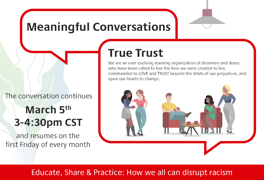
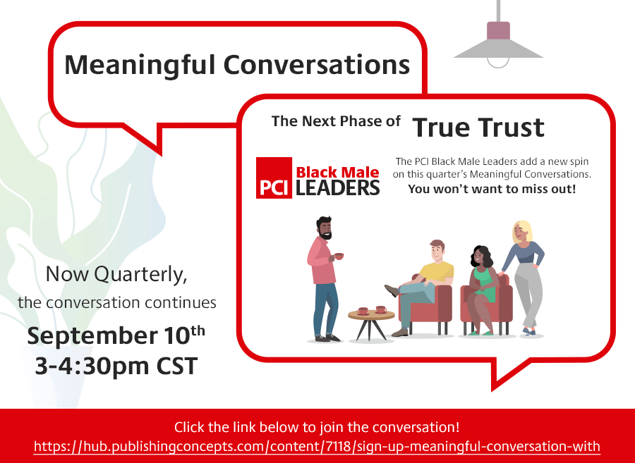
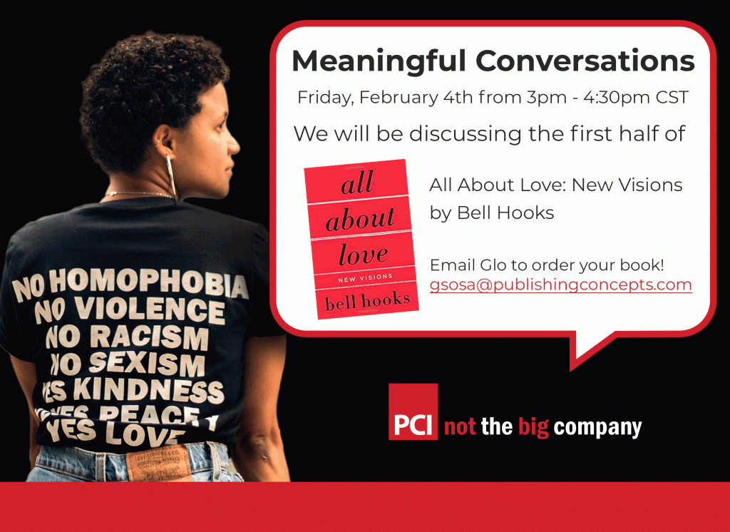
Meaningful Conversations was not one event graphic. It was a recurring employee discussion series that needed a visual identity strong enough to connect announcements, reminders, topic changes, and follow-up communication over time.
The speech-bubble structure, red line, photography, and consistent information hierarchy made the series easy to recognize while leaving enough flexibility for each new conversation to have its own subject and tone.
Showing the thinking, not only the winner
Logo and identity work involves exploration: deciding how closely a new initiative should relate to the parent brand, what needs to remain legible at a small size, how the mark will behave in one color, and whether the idea can extend beyond the logo itself.
These concept sheets preserve that decision-making process. They show the range considered before a direction was selected, refined, and used.
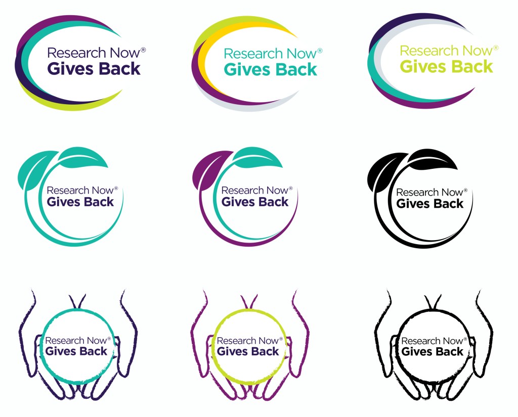
Exploring how a social-impact program could connect to an established company identity.
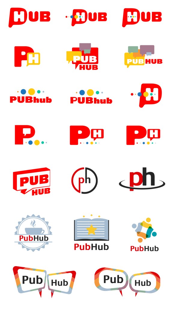
Testing tone, legibility, and visual personality for an employee platform.
GRAPHIC DESIGN USA
AWARD-RECOGNIZED INTERNAL BRAND WORK
Decisions Matter
I produced and edited the internal brand video that introduced APL’s Decisions Matter theme to employees. The work received recognition from Graphic Design USA and was later repurposed for external client communication.
The full video and the story behind it live on the Video portfolio page, where the motion, sound, pacing, and production can be seen in context.
Culture work should feel like the people it is for.
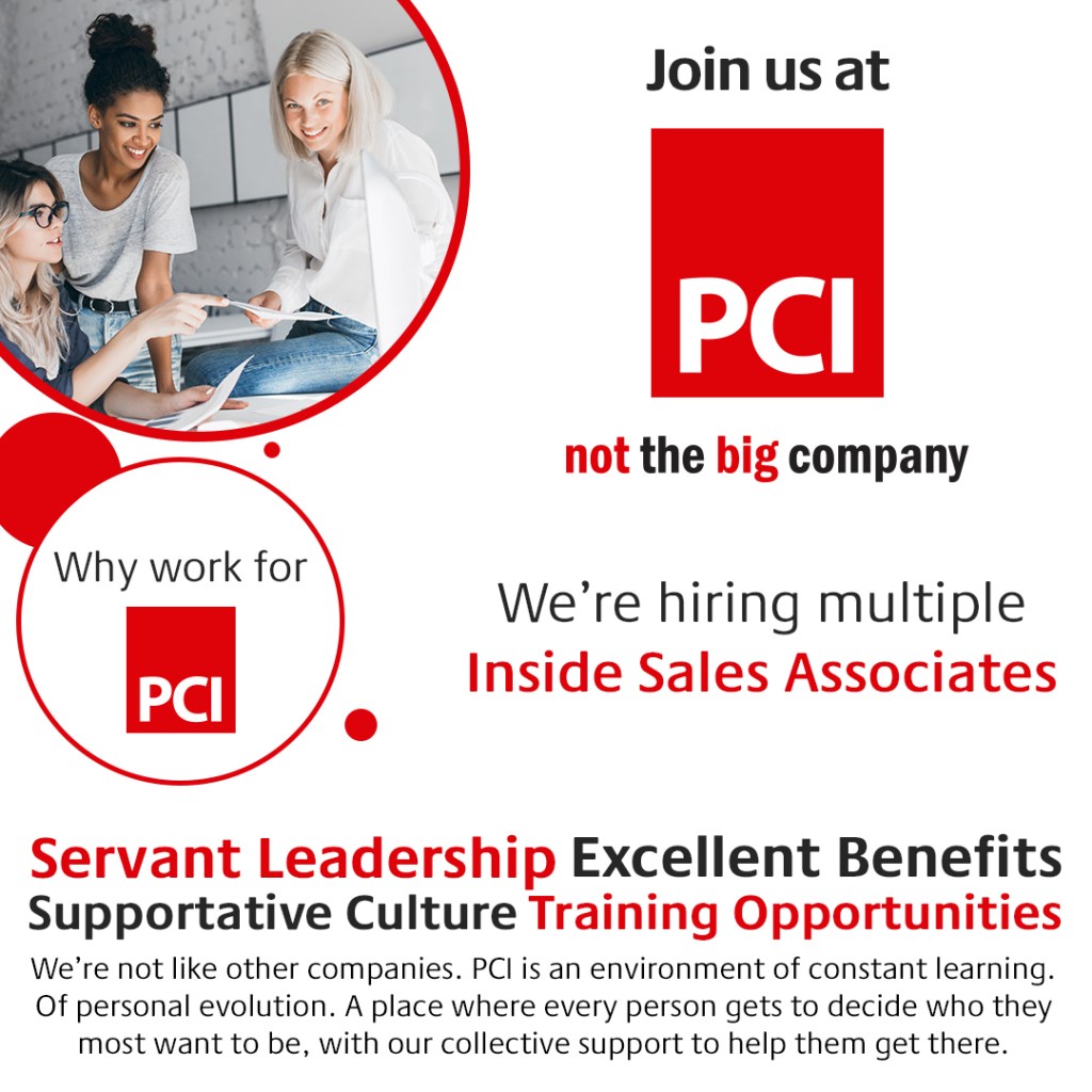
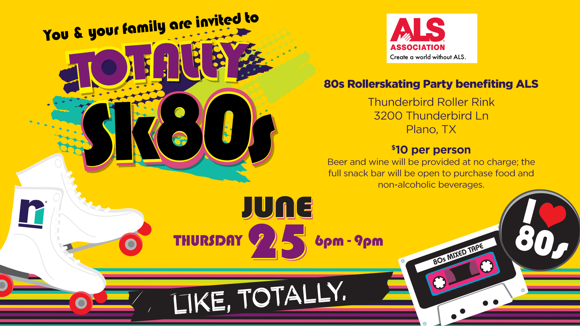
Employee events, appreciation, and recruiting communication can carry more personality than a standard corporate announcement. The visual language still needs discipline—but it should also feel fun, specific, and worth noticing.
These holiday invitations were built as complete digital pieces: an animated upper half created the atmosphere and caught attention, while a static lower panel kept the date, location, and event details easy to read. The screenshots only show half the idea; each video and information panel belong together.
2016 Holiday Party invitation
The animated scene was the upper half of the email invitation; the illustrated information panel completed it below.
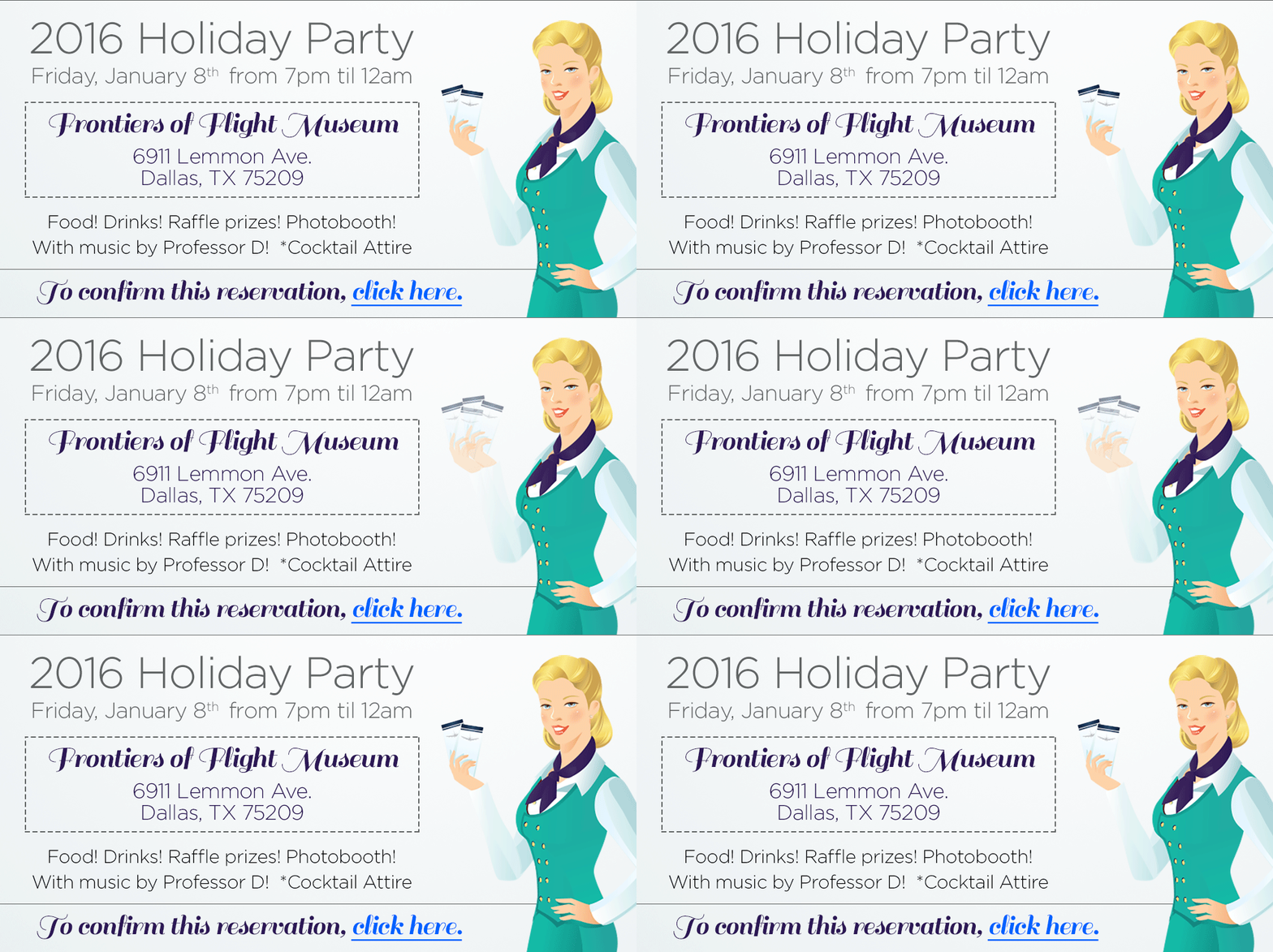
Animated upper panel + static event information
House of Blues Holiday Party invitation
Here too, the motion piece was designed as the invitation’s upper half and the venue information remained visible below it.

Animated upper panel + static event information
More culture and recruiting design
Need a designer who can think past the first deliverable?
I’m especially interested in internal communications, employee experience, creative communications, multimedia, and culture-focused roles where design judgment, message clarity, and hands-on production all matter.
 Home
Home 