

Turning a fast-turn production assignment into a polished 45-slide presentation
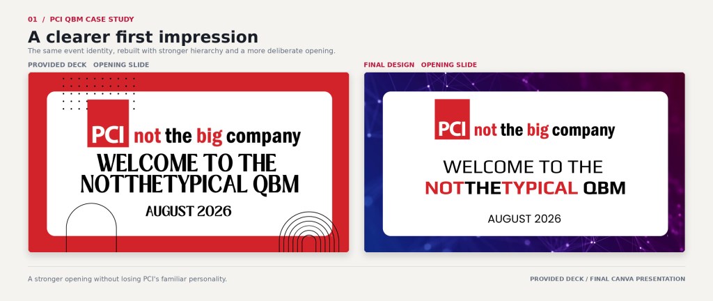
PCI reached out a few days before its August 2026 Quarterly Business Meeting with an in-progress Canva deck and information still coming together. Drew Clancy, PCI’s President and CEO, described the work as “almost data entry.” The immediate priority was to get the content in place and leave the company with a usable presentation. If I could “jazz it up a little bit,” he said, that would be fabulous.
This was not a redesign brief. I entered the required content as soon as I received it, then worked section by section and slide by slide to improve the deck where I believed the remaining time would make the greatest difference.
That judgment came from three years of working closely with Drew. I knew what he liked a Quarterly Business Meeting to feel like, and he knew my skill set, pace and work ethic on these presentations. The finished deck went well beyond the basic production need while keeping the original goal intact: give PCI a strong presentation it could use on time.
Project Snapshot
Company: Publishing Concepts (PCI)

Project: Q3 2026 Quarterly Business Meeting
Role: Freelance presentation designer and creative production partner
Initial assignment: Populate, update and make an in-progress presentation usable
Scope: 45-slide working presentation
Audience: All PCI Associates
Schedule: 3 Days
Final delivery: Editable presentation completed and presented in PCI’s Canva space
Tools: Canva, Illustrator, AfterEffects and AI-assisted image development and editing
The Assignment
PCI supplied an in-progress Canva deck containing business updates, leadership messaging, anniversaries, company values and several types of Associate recognition. I had not designed that presentation, although it reused some visual elements I had created during my three years at PCI.
It was also the first full presentation I had designed in Canva. I had used the platform for flyers and social media graphics, but not for presentation work. Canva was new to me in this context; the design decisions were not. I adapted my presentation experience to the platform while working through the live project and its short schedule.
The first responsibility was straightforward: enter the information, incorporate new material as it arrived and make sure PCI had a presentation it could use. Any design improvement had to fit around that priority.
The deck presented several practical design problems:
- Bold visuals needed to feel energetic without competing with the information.
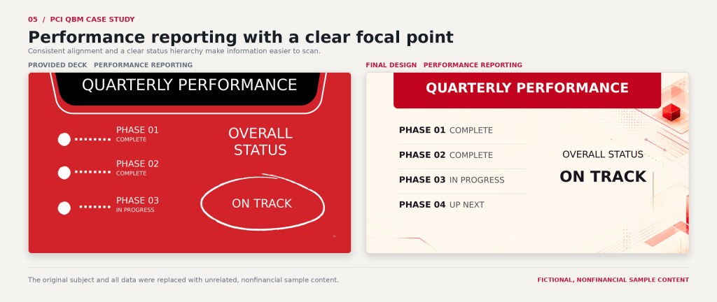
- Dense slides needed quieter layouts and more room for the content.
- Recognition sections needed to feel celebratory and related without becoming repetitive.
- Associate photographs arrived in different sizes, crops, lighting and quality.
- New information, replacement photographs and corrections continued to arrive as the meeting approached.
- Everything needed to remain editable in Canva for presentation and future use.
How I Prioritized the Work
Content first
As soon as Drew supplied names, photographs, figures or slide content, I entered them. Securing the required information first gave me a clear view of the time still available for design.
Start with a quick, visible improvement
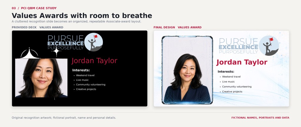
The Values Awards were the first complete section available, so they were the easiest and fastest place to begin. I cleaned up the layout and typography, added subtle animation and let Drew know what I had done.
Two days later, he sent PCI’s revised long-range vision and asked whether I could animate it in a style similar to an earlier purpose sequence I had created. He noted that the piece would be used “again and again.” The request did not turn the assignment into a formal redesign, but it confirmed that the added design work was welcome.
Use the remaining time where it mattered most
Once the required content was in place, I returned to each section and made improvements based on what the audience needed from that part of the meeting. Some slides needed more energy. Others needed the design to step back. I preserved what was already serviceable and concentrated on the places where better pacing, imagery, hierarchy or flexibility would have the most effect.
There was no lengthy discovery process or formal handoff between production and design. My familiarity with Drew, PCI’s culture and the role these meetings played helped me make those decisions quickly.
Giving the Presentation a Clearer Rhythm
I did not try to turn the deck into a restrained corporate presentation. PCI’s Quarterly Business Meetings were meant to feel like events. The better solution was to give that energy somewhere to land.
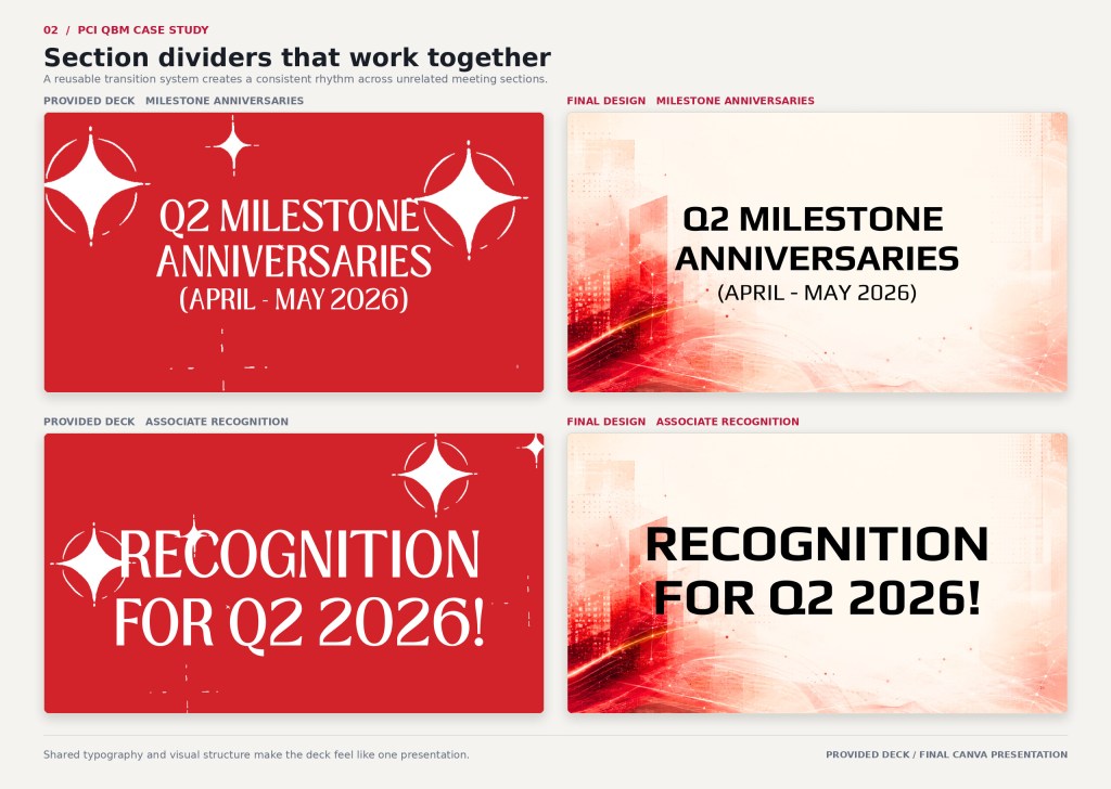
Title and transition slides could carry larger visuals, brighter color and animation. Content-heavy slides needed calmer supporting layouts so Associates could move from celebration to business information without every slide competing for attention. Repeated section openers helped divide the 45-slide presentation into recognizable chapters.
Related backgrounds for different jobs
Several dramatic backgrounds worked well for titles but left nowhere for copy to sit. I created companion treatments with simpler compositions, controlled contrast and open text areas. The related versions gave PCI more flexibility without making the deck look as though it had changed themes.
Recognition that felt celebratory and connected
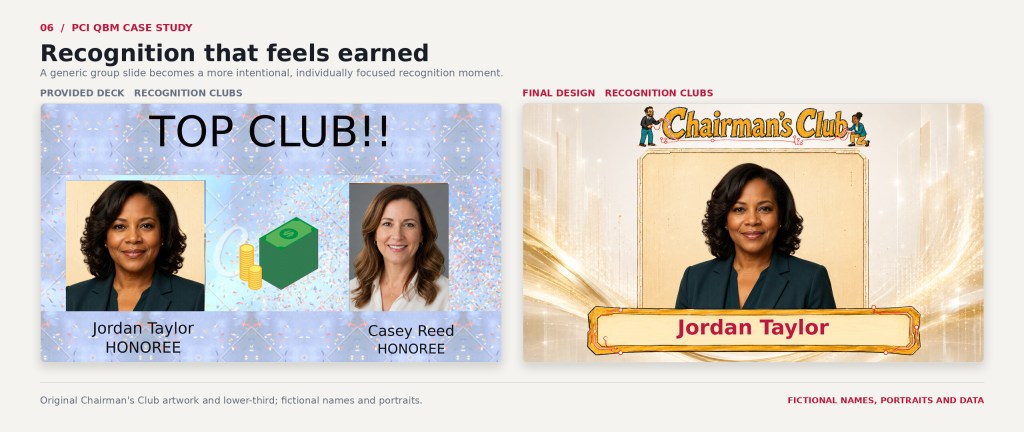
Recognition was one of the most visible parts of the meeting. I created coordinated treatments for milestone anniversaries, company values and several achievement levels. The sections were distinct enough to make each moment feel special while still belonging to the same presentation.
The work included:
- Milestone anniversary layouts that gave long-tenured Associates more visual presence
- Company-values treatments connected to PCI’s established language and imagery
- Coordinated recognition backgrounds and title artwork
- Individual hero-photo layouts for the highest recognition level
- Slim plaque-style lower thirds that held the necessary information without covering the portraits
- Reusable frames and transparent assets that could be rearranged quickly in Canva
Making varied photography feel intentional
The Associate images came from several sources, including polished headshots, casual snapshots and screenshots. I adjusted crops, contrast, framing, proportions and placement to make each recognition group feel more consistent.
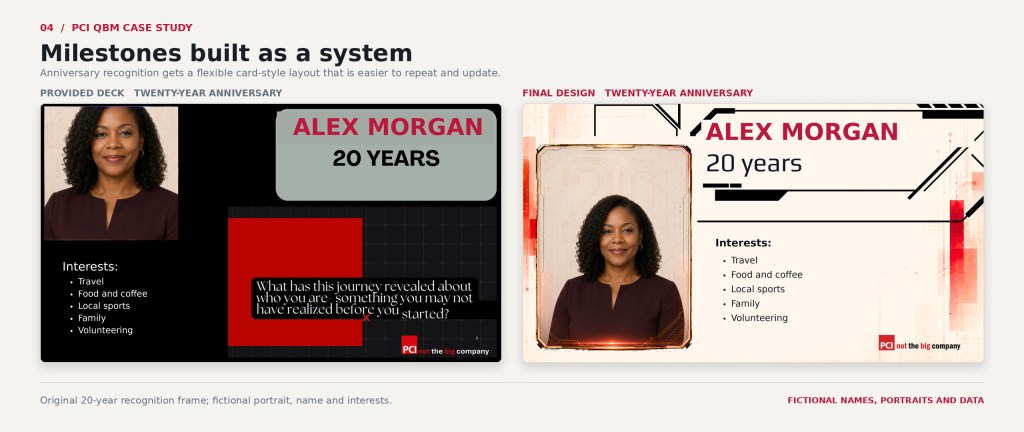
When one layout proved too rigid, I separated the background, frame, portrait treatment and plaque into individual pieces. I try to build presentation elements so someone without design experience can make a simple update without rebuilding the slide. That flexibility also helped when a new group recognizing revenue earners was added late in production.
Motion and Reusable Assets
The presentation included subtle movement within the recognition slides and a more substantial animated treatment for PCI’s revised long-range vision. Because PCI expected to use the vision sequence again, I treated it as a reusable communication asset rather than a one-time effect.
I also checked the full deck for inconsistent animation settings, missed replacements, awkward crops and other small problems that could become distracting during the meeting. That production work is easy to overlook in a finished presentation, but it is part of what makes leadership comfortable presenting from the file.
AI-Assisted Visual Development
AI-assisted image development helped me explore background, illustration and recognition concepts within the schedule. I still had to evaluate the results, redirect the visual approach, discard weak directions, repair usable elements and prepare the final assets for Canva.
Companion case study: See The Work Between “Generate” and “Finished” for the iterations, feedback and art direction behind the final assets. [COMING SOON]
Final Production
The final stretch combined presentation design with a small live production queue. PCI supplied additional business slides, revised language, reordered values, replacement photographs, a preferred-name correction, an added revenue-earner recognition group and an updated roster for the meeting’s random drawing.
I incorporated each item while continuing to review the deck section by section. The deadline itself remained fixed; the job was to keep the required information current while protecting the quality and usability of the presentation.
Outcome and Impact
The finished 45-slide presentation was completed in PCI’s Canva space and presented directly from Canva at the all-Associate Quarterly Business Meeting. I later created PDF and MP4 exports for my portfolio documentation.
In approximately 14 hours, I populated the incoming content, improved the presentation’s pacing, built custom recognition treatments, created motion and reusable assets, and completed a full production check. The final deck retained the lively character PCI wanted while creating clearer transitions between business information, leadership messaging, anniversaries and recognition.
The flexible asset structure made the late revenue-earner addition easier to accommodate and left PCI with editable elements it could continue using.
“EVERYTHING LOOKS AMAZING!!”
— Drew Clancy, President & CEO, Publishing Concepts
 Home
Home 